Summary: A series of data visualizations inspired by the Bentley campus's waste dataset
Methods: Clean 4 years of data from the waste volume report, research data viz studies, create personal visualizations, submit findings in a detailed video presentation
Graphics: Vicons Design (The Noun Project)
Tools: Adobe Illustrator, Figma, Google Slides, Microsoft Excel, Tableau

Background
The Office of Sustainability at Bentley University wants to be a model of environmental responsibility by focusing its approach on the intersection of the environment, society, and economy. They aim to provide positive changes in the environment and offer educational and leadership opportunities to Bentley's students. Their overall goal is to eventually gain 100% neutrality, which will not only contribute to a sustainable future for people, it will also save money for businesses.

Process
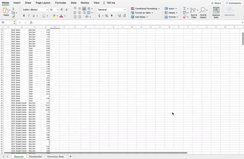
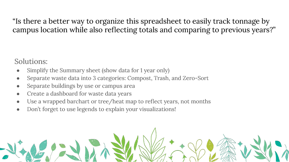
One example from the waste volume report. The sheets at the bottom show trash, recycling, and compost tonnage on campus by building. There is some data missing, conflicting colors, and confusingly, trash data was entered in both the Dumpster and MSW-C categories.
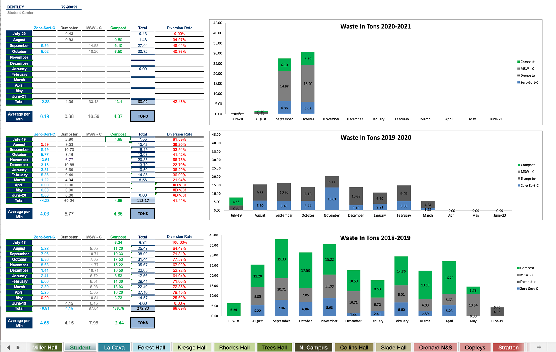
A screenshot of the provided data
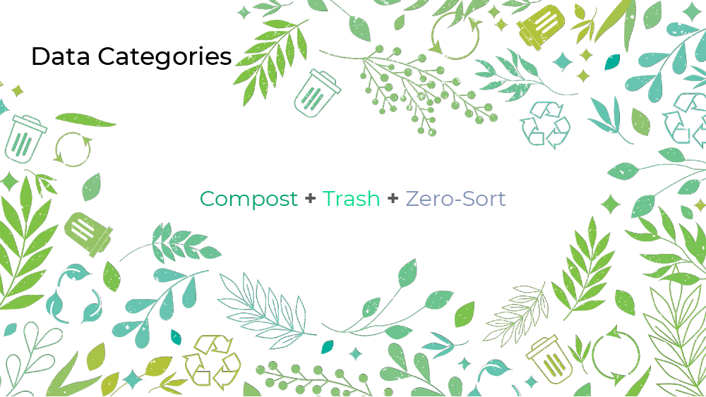
The spreadsheets separated waste into five discrete categories: Zero-Sort, Dumpster, MSW-C, Compost, and Other Resources. For reference, zero-sort means recycling. Dumpster and MSW-C (Municipal Solid Waste Compactor) both mean trash and are in different categories based on their locations. Compost refers to food waste and only buildings with Bentley Dining kitchens collect that data. Due to a lack of data, "Other resources" were not included in this study. To simplify the data even further, I combined the Dumpster and MSW-C categories into one and relabeled it as “Trash”, leaving 3 main waste categories.
Diversion is the amount of waste that is not incinerated or taken to landfills. The performance goal of the Office of Sustainability is to get the waste diversion to an average of 60%.
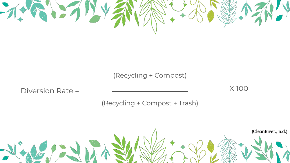
The equation that calculates diversion rate
I transferred the data to a new file and divided it by building type (general and residential) and year. I discarded categories with incomplete data.
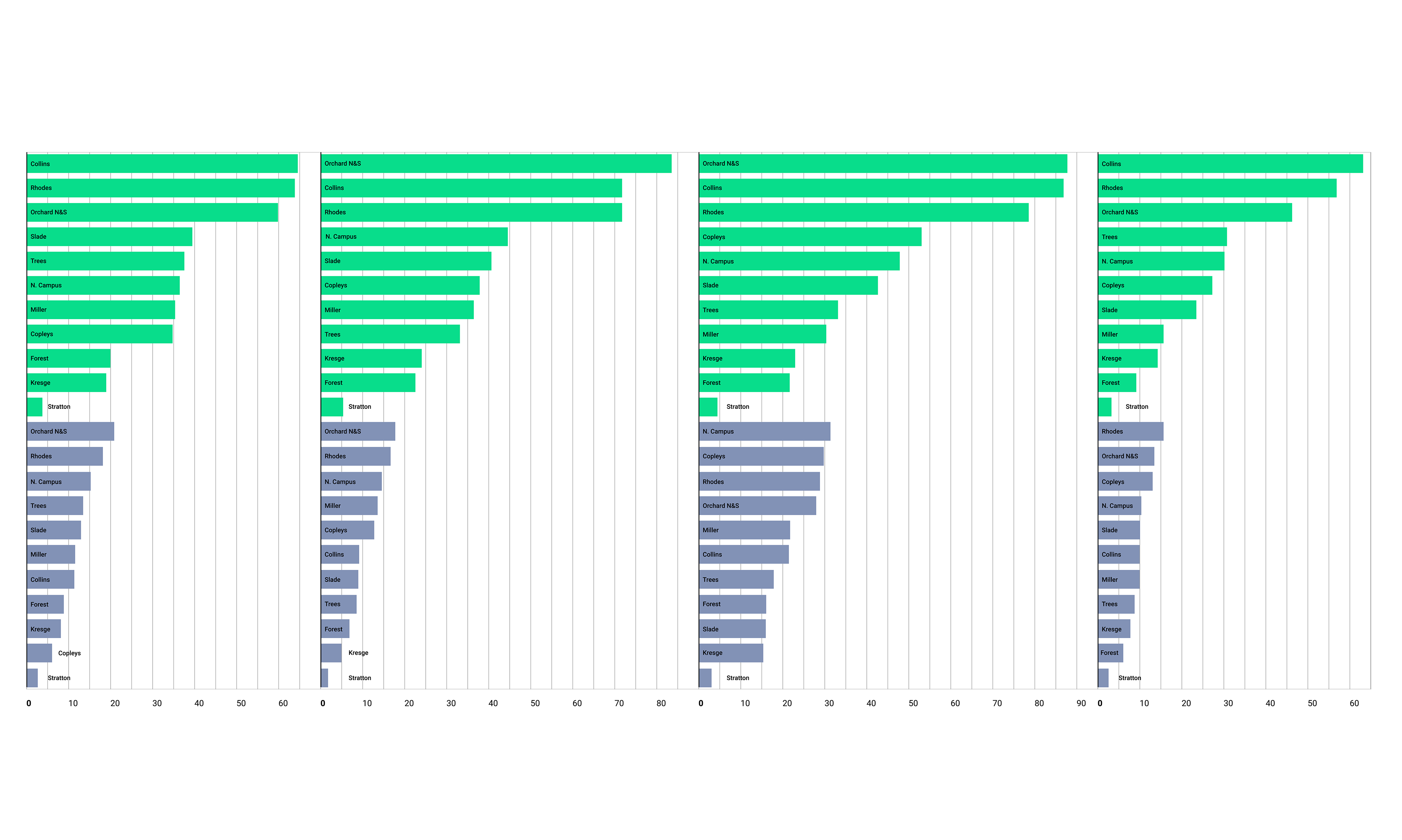
Wrapped Bar Chart
To visualize totals by buildings, I used a wrapped bar chart design because it allows the user to view and compare each year of data at once without having to scroll.
Total Waste Tonnage of General Buildings (2016 -2019) - Wrapped Bar Chart
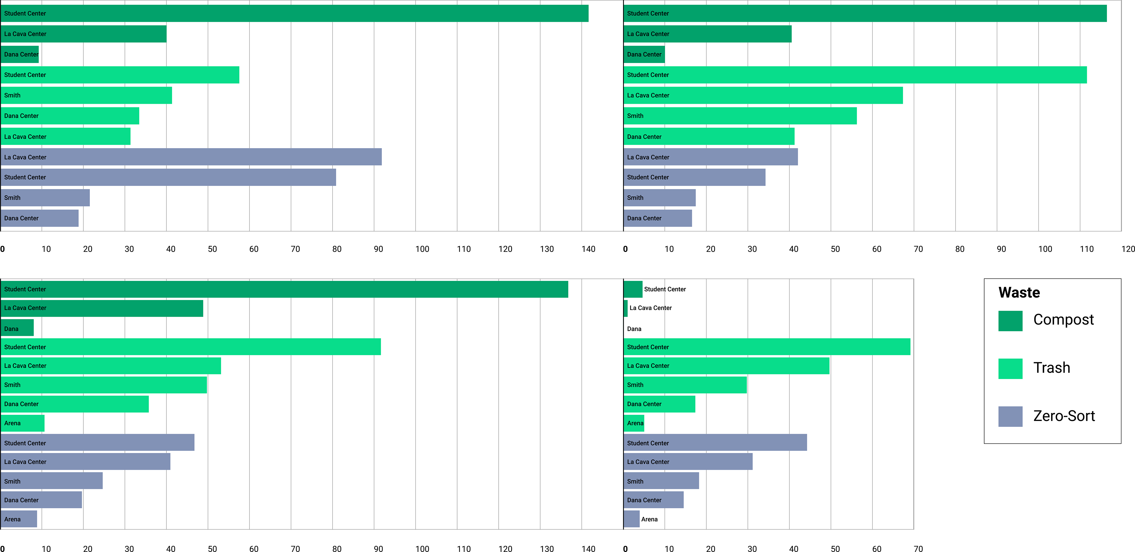
Total Waste of Residential Buildings (2016-2019) - Wrapped Bar Chart
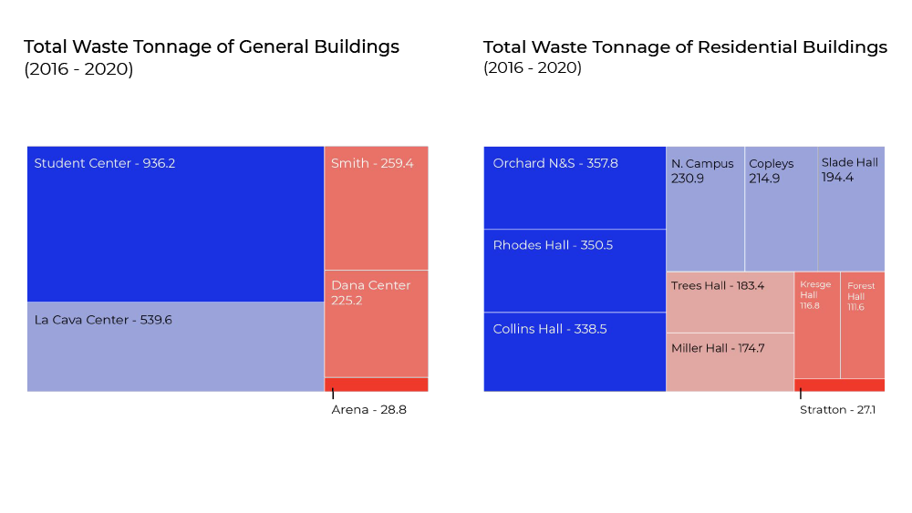
Tree/Heat Map
Instead of reading every waste measurement per building, the treemap structure can assist in the perceptual task of understanding which buildings produce the most and least amount of waste. Another way to reduce cognitive load is to use color saturation to provide visual cues. Contrasting colors highlight the buildings with significant data.
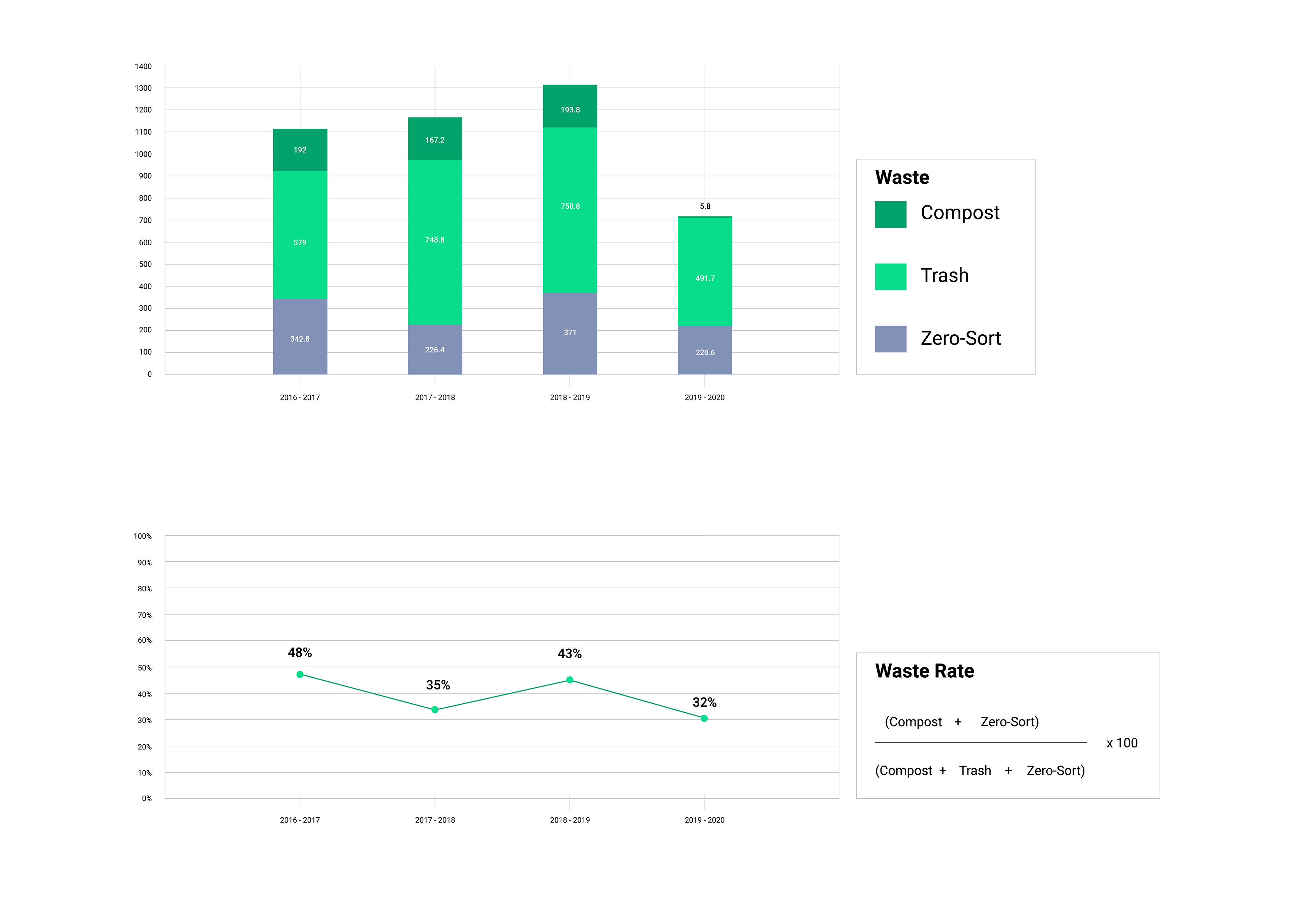
Waste Rate Percentage - Dashboard Analysis
Dashboards can show multiple types of data at the same time. I took the total tons of waste for all recorded years in the form of a stacked bar chart and placed it below a line graph depicting waste diversion analysis. A simple line graph with points shows the pattern for each year. It is now easy to see that the diversion rate goes up with a larger ratio of recycling and compost to trash.
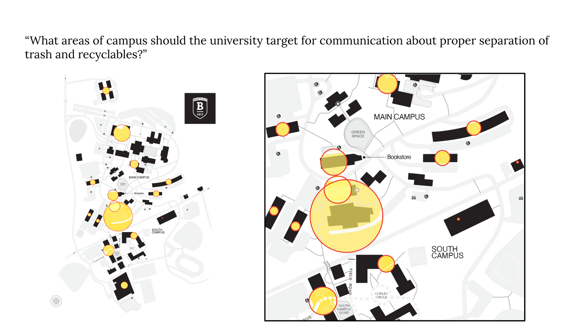
An unused bubble chart I created from my data was scaled and placed over a map of the campus to highlight the areas where the most waste was generated. Orchard Hall, Rhodes Hall, and Collins Hall generated the most waste in residential buildings. Student Center and LaCava Center produced the most waste in both general and overall buildings.

Full video