Summary: A team project focused on the usability of the Interhaptics website
Methods: Create survey and moderator script, conduct testing, write report, present findings
Role: Presentation and report design (mainly), testing (2), note-taking (1), assessing, presenting analysis
Tools: Adobe Illustrator, Google Slides, Qualtrics, Zoom

Background
Interhaptics is a software company that specializes in haptics and interaction feedback for virtual reality (VR), augmented reality (AR), and extended reality (XR). Their software is heavily used in video games, mobile phones, demonstrations, and training materials. The company sells licenses or “seats” to their software. The focus of their website is to create prospective customer engagement through video demonstrations and community engagement which in turn to convert visitors into customers.
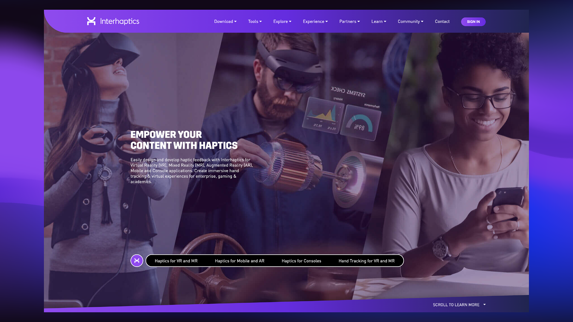
The home page
Process
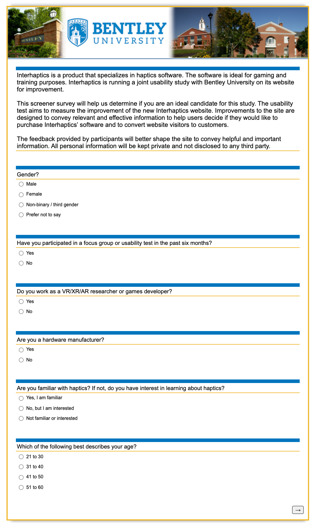
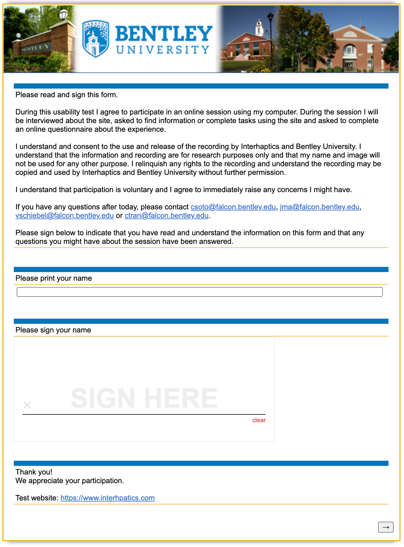
We used Qualtrics to prepare our screener, consent form, and post-test questionnaire. The program also assisted us with statistics.
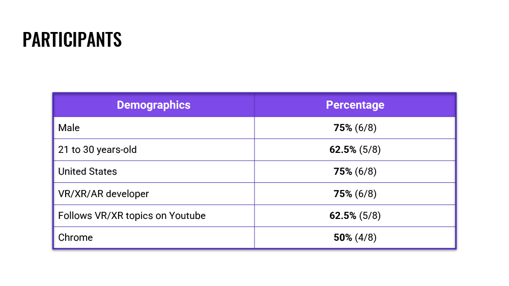
From nine individuals, we selected eight for testing. A few key demographics that stood out were that six participants were male and two were female. The majority of participants were aged 21 to 30 years-old and resided in the United States. 75% were either VR/XR or AR developers. Over 60% of the participants used Youtube as their platform of choice to follow VR/XR news and topics.
All sessions were conducted and recorded over Zoom.
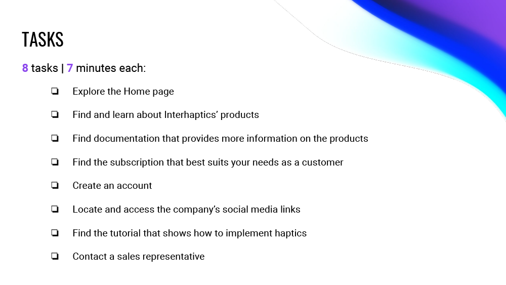
We gave the participant a scenario depending on their expertise but the tasks remained the same for all. There were a total of 8 tasks. Unknown to the participant, if they had not completed a task by the end of seven minutes, the task was marked as “failed”. Actions such as errors made and how many times the moderator had to prompt the participant were noted.
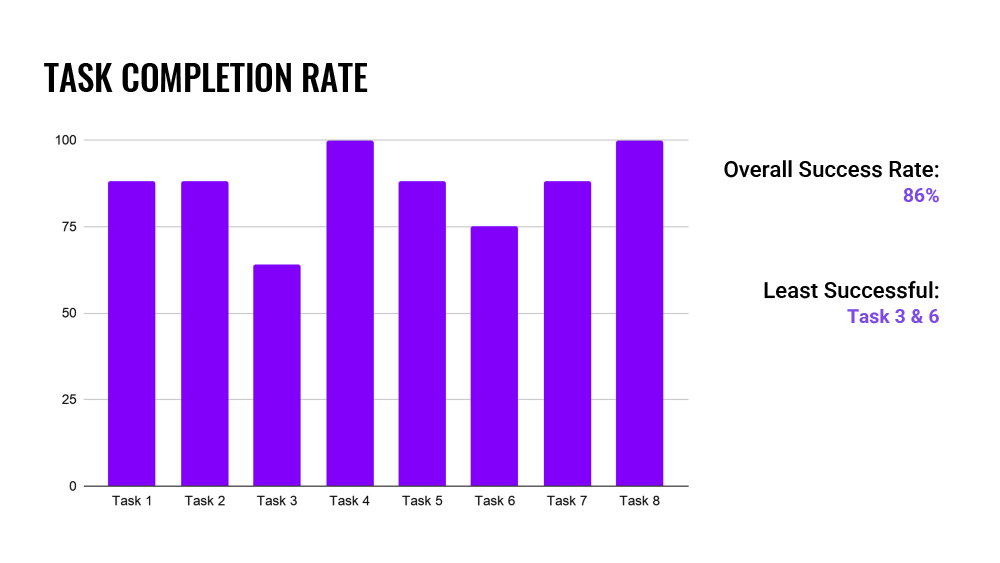
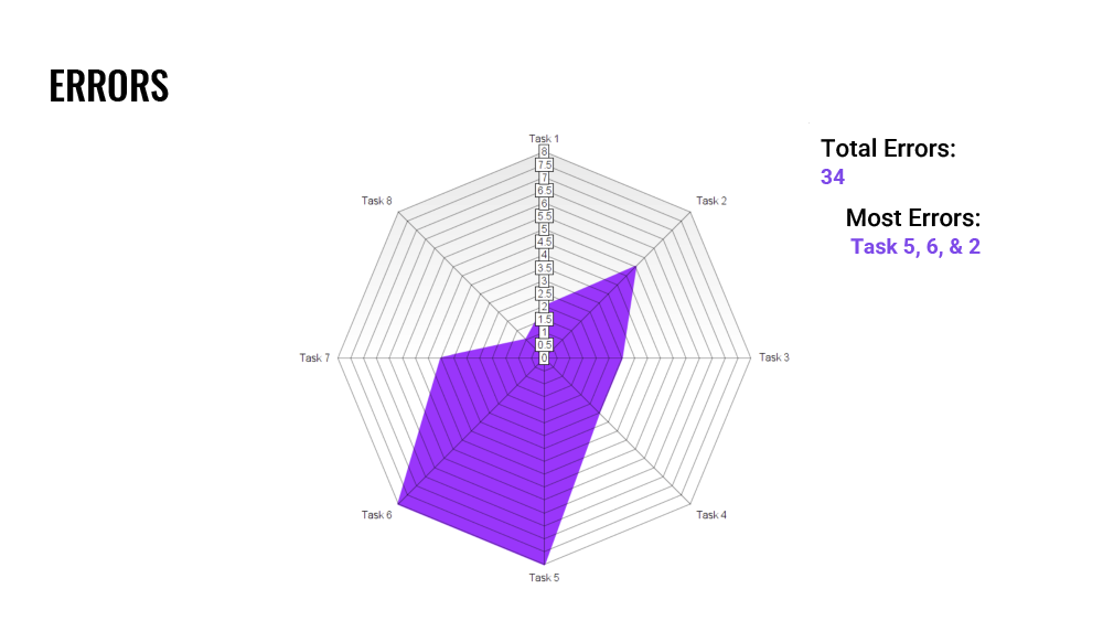
Task completion and errors made were visualized in a bar and radar chart.
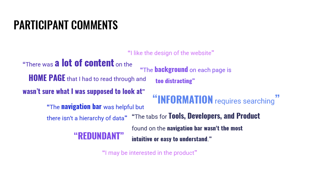
Some comments on the website made by the participants
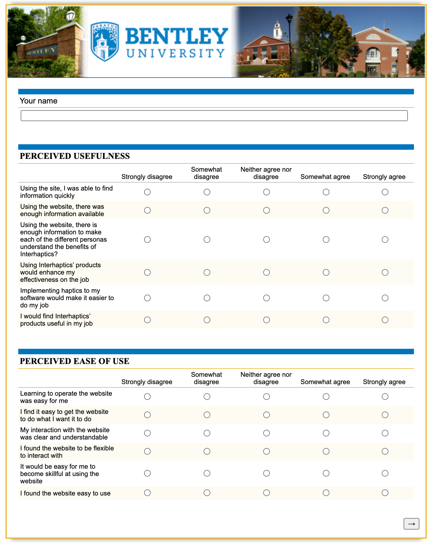
The post-test questionnaire
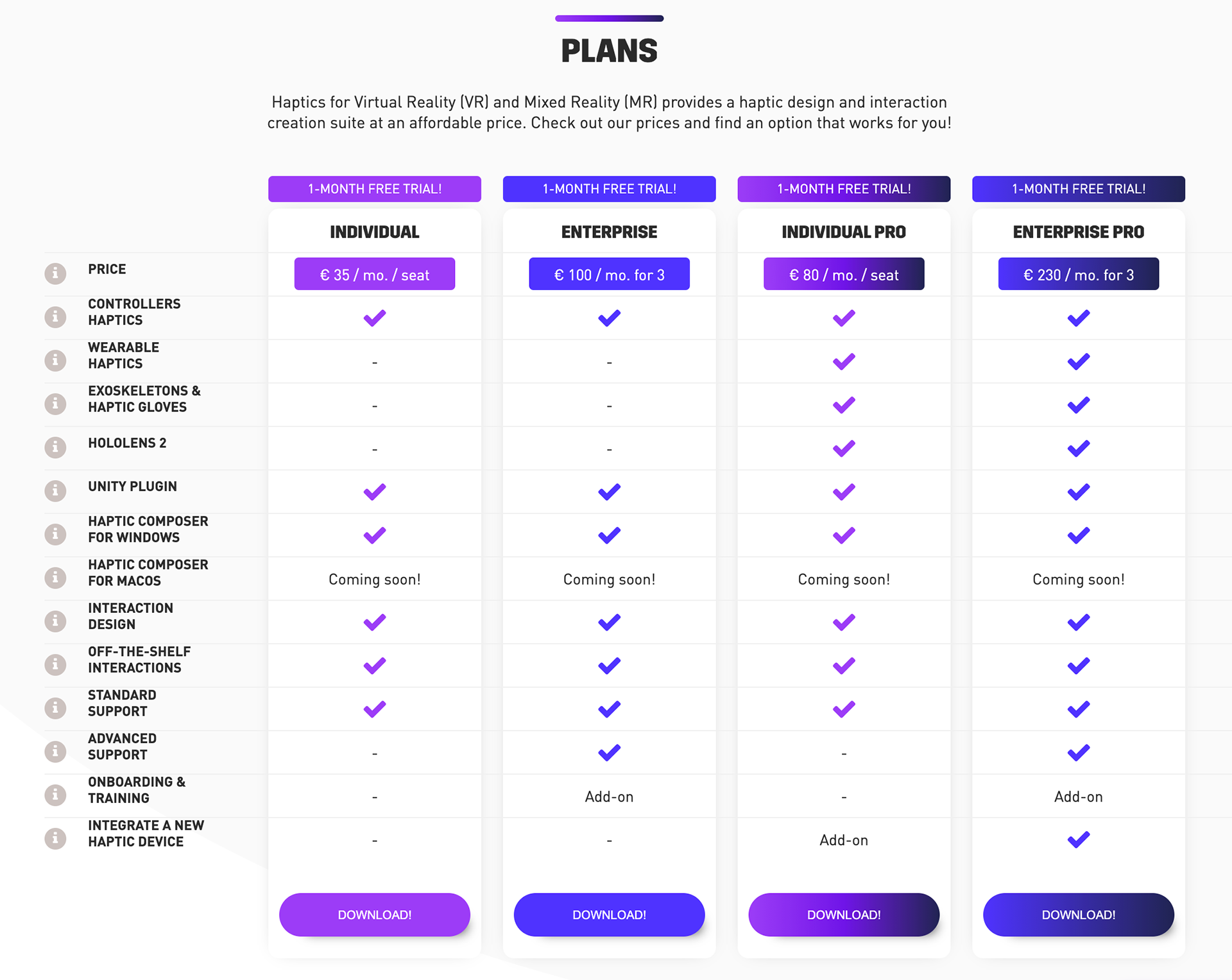
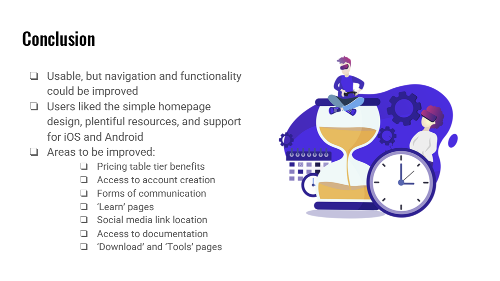
The highest priority recommendation was to fix the functionality of the pricing table. Many participants found some of the language confusing. Right now, icons next to the pricing charts are interactive and provide additional information, however not many users realized that. All buttons should show information when a user hovers their mouse over them. Currency should automatically change based on the user’s region. Currently, the prices are set to euros.
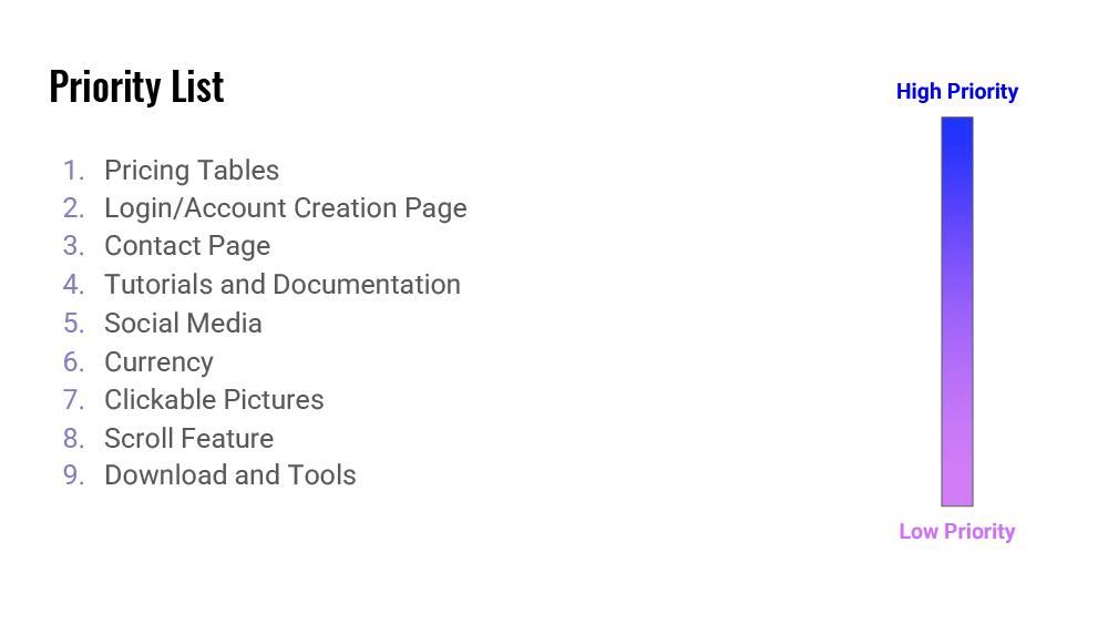
The conclusion summarized the overall impressions of the website according to the participants. Recommendations were prioritized from high to low. It is important to note that these recommendations are not prioritized based on the amount of use errors encountered during tasks, although that did play a part in this decision making. Instead, they are prioritized based on usability related to the critical tasks that are directly associated with Interhaptics’ business goals of retaining current customers, and converting site visitors to customers.
Next Steps
It is recommended that Interhaptics perform card sorting or other architecture information exercises with their intended participants to determine a more accessible layout to improve usability.