Summary: A team collaboration to create an educational video on data visualization for students of the LEAH project
Methods: Decide theme, plan topics to cover, research examples, prepare script, design slides
Role: Presentation design (mainly), contributed towards research and script
Graphics: The Noun Project
Tools: Adobe Illustrator, Google Sheets, Microsoft Excel, Microsoft Powerpoint

Background
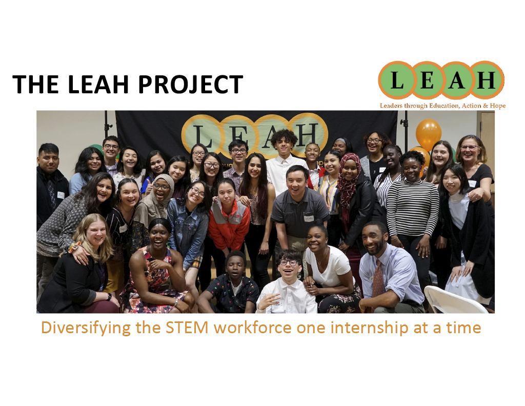
The Leaders through Education, Action and Hope (LEAH) Project is a STEM, college access, and career readiness program for Boston area youth typically underrepresented in STEM fields (low-income youth, youth of color, first generation college youth) with the vision of increasing representation of Blacks and Latinos in STEM professions.
Our goal was to create an educational video on data visualization for the students.

We wanted to present a holistic overview of data visualization. Topics covered:
- What is data viz?
- Why is it important?
- What are some best practices when creating data visualizations?
- What are some career opportunities?

We aimed for a theme that was professional but also something that high school students would be able to understand and enjoy. We focused on a gaming narrative that would introduce data visualization as a type of mission to complete.
I created all the backgrounds in Adobe Illustrator. My intention was to create the look of a futuristic dashboard.
After providing a brief overview of data visualization, we introduced 5 basic steps to best prepare information.

Introducing steps
Three things to ask yourself: Who are you presenting your data to? What are you showing? Why are you showing this data?
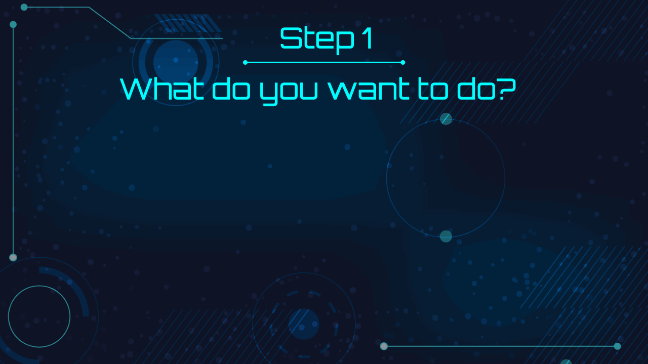
Step 1: Determine what to do with the data
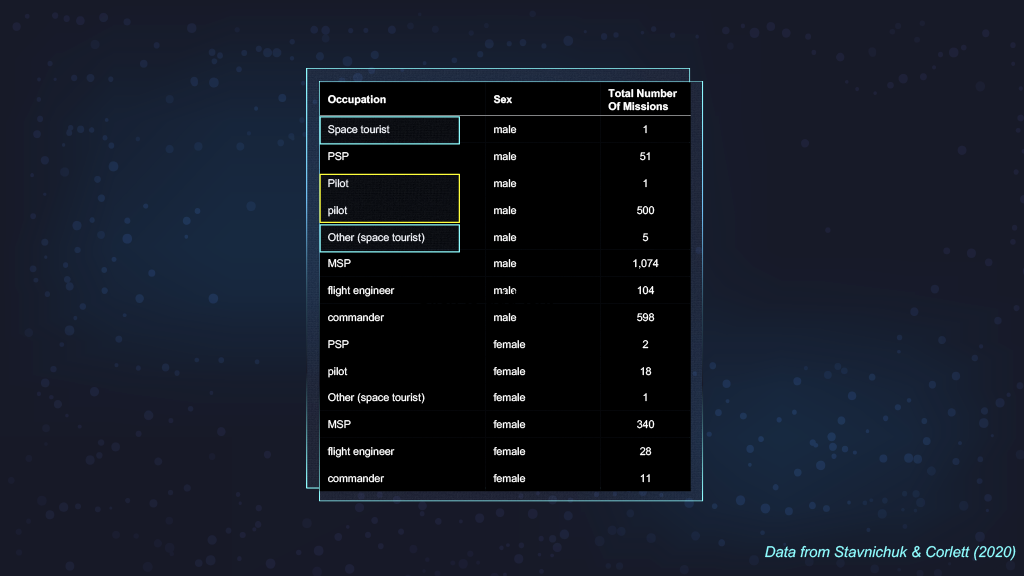
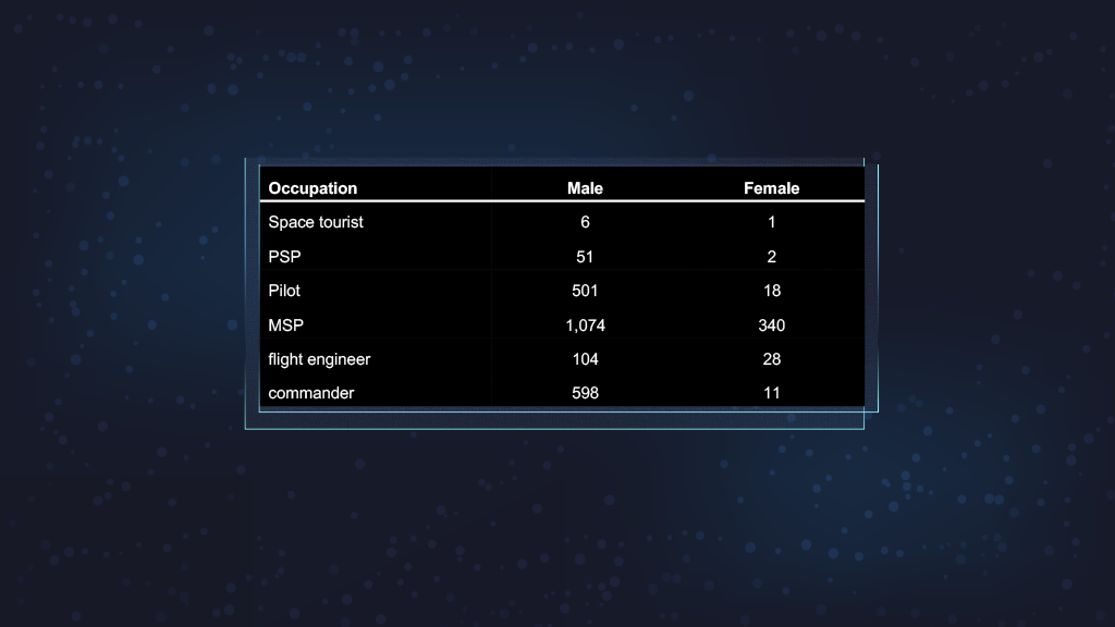
The next step is to identify issues with your collected data and "clean" it up.
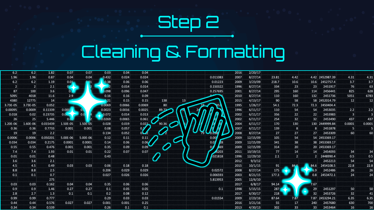
Step 2: Clean and format the data
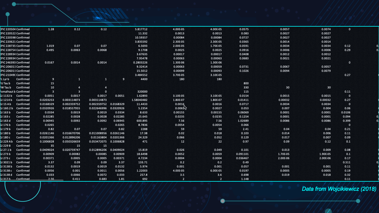
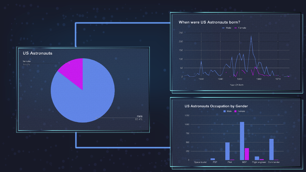
We needed to quickly show an example on how to clean the data. Redundant information such as "pilot" and "Pilot" were in the original data. The reformatted data on the right is simpler, thus easier to read and understand. The original data can be viewed here.
This step is where to start visualizing to get a better sense of what the data looks like.

Step 3: Understanding and selecting what to visualize
The next step helps students how to select the best chart to represent their data.
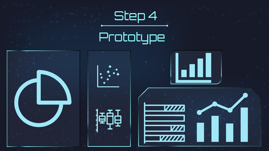
Step 4: Creating visuals through prototypes
All the charts in the presentation were created in Google sheets. We wanted to use data visualization tools that are accessible for everyone.
Which is the best chart to use?
The last step is to always look for feedback!
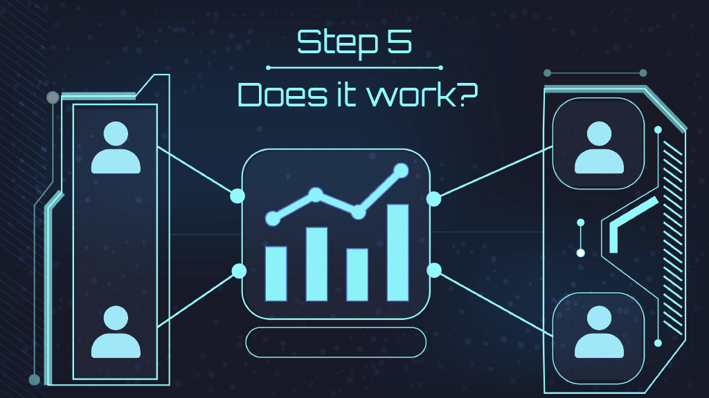
Step 5: Confirm that the visualizations work

Best Practices
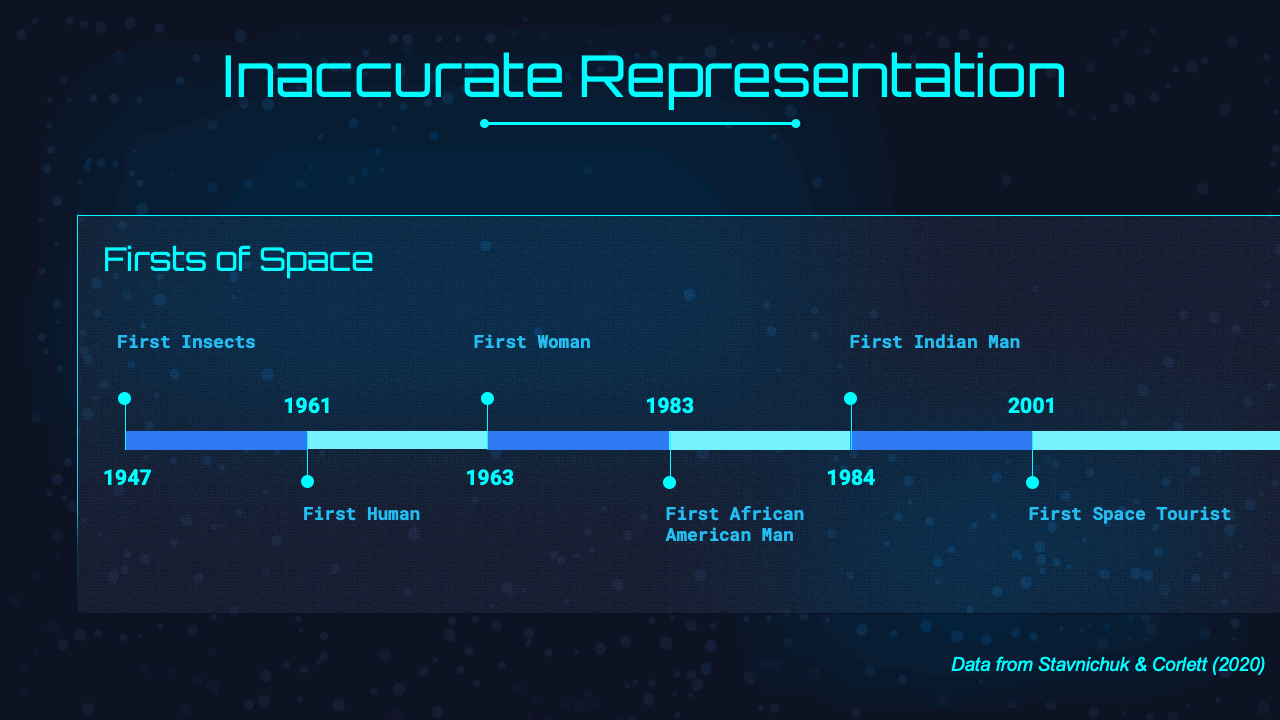
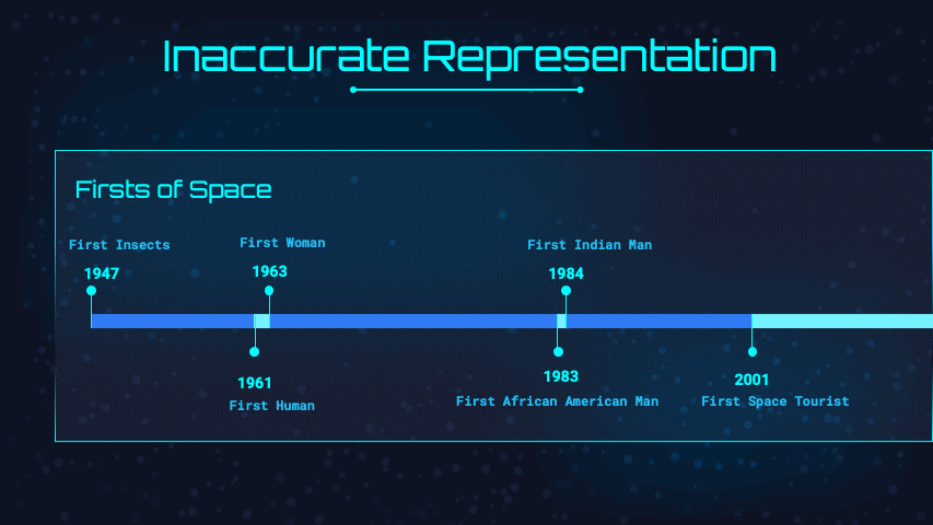
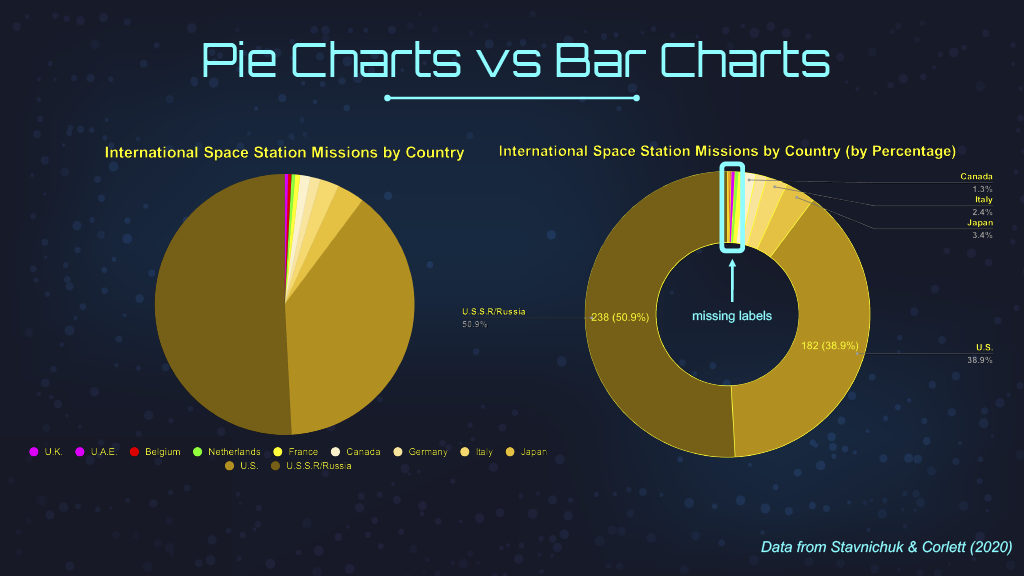
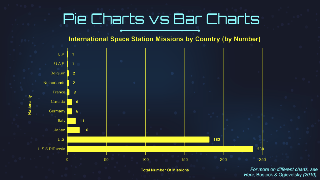
Below are a couple of examples on how to improve bad visualizations such as accurately portraying your data and how bar charts are more effective than pie charts. More examples are shown in the video below.
Careers
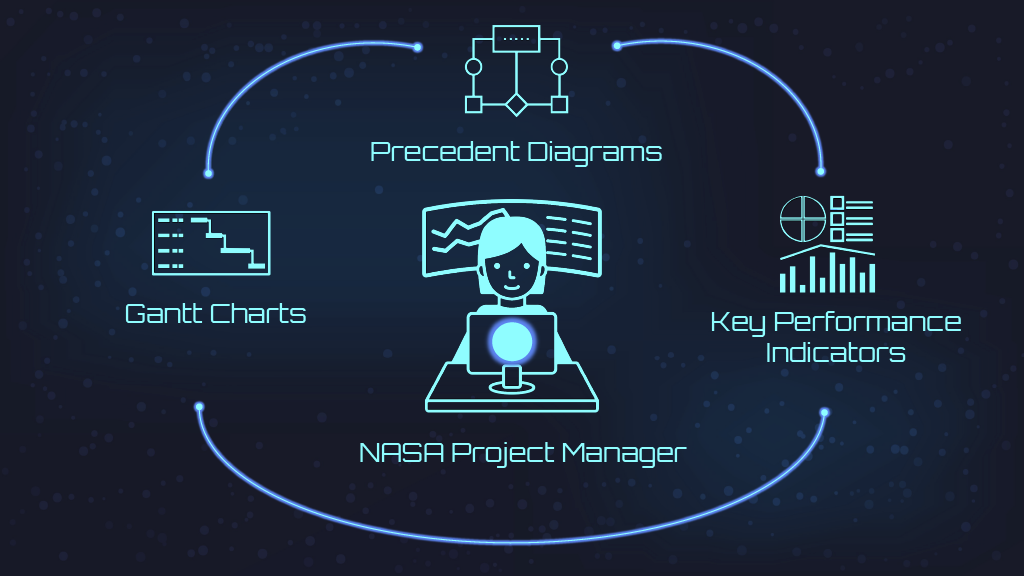
We stayed within our space theme by going over the daily tasks of a NASA project manager. a NASA project manager — who would be responsible for managing work tasks, schedules, and budgets — would use visualization tools like Gantt charts to monitor schedules, precedent diagrams for planning, and graphs tracking key performance indicators over time to measure success.

The end of the presentation was a nod to the design of a scatterplot

While we realized that some of the data we showed may be discouraging for young women and nonbinary people, we meant to highlight the inequality of history and hope that our presentation informs and inspires our audience to pursue a career path in this industry.

Full video presentation